
Corporate Identity: Rebranding The Vegan Agency
General, Plant-based sector, Vegan communication agency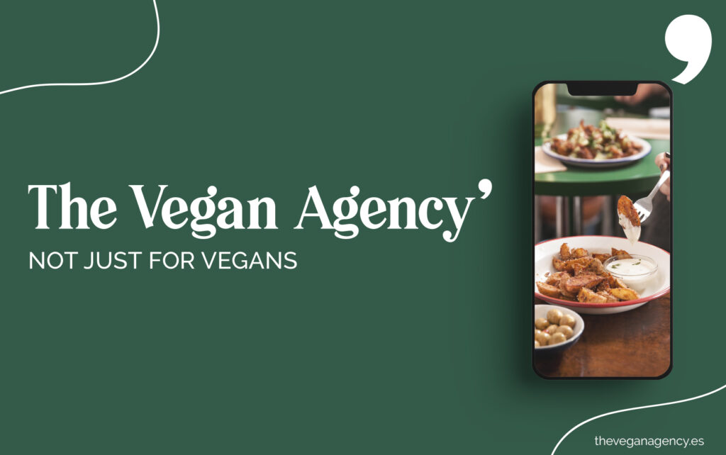
Although we try to reserve this blog to talk about our clients and stick to the idea that the most important person is the one on the other side – you, dear reader – sometimes there’s nothing for it but to toot one’s own horn a little.
The well-used phrase “new year, new life” sums it up quite well as we have expanded and updated our corporate identity two years after we opened our digital doors.
First, we’d like to thank Pilar Roca (The Wild Rocks), illustrator of the book Viaja Vegano published with Elisa Blanco (Anaya Touring editorial), for having created our brand and corporate identity which we are so fond of.
It was a total win to work with her as part of the agency and her designs for our logo were perfect; as you can see we haven’t changed a thing.
However, Pilar has moved on to greener pastures and we thought that the best way to welcome our new design guru and creative director Lucia Sierra was to set her loose on our branding and update it for us. As you can see, the result is branding that mixes together the best of autumn, encompassing more sober earthy colours, with sping notes such as salmon and mint green.
We wanted to reflect that fact that there are many many years of experience in Veganism behind the agency, but we are dedicated to evolve with the times to keep communicating in a coherent, dependable and trustworthy way, but with a splash of fun, creativity and innovation.

Launch: Not just for vegans claim
We got a few people asking if we aren’t a vegan brand any more after we added the claim, but don’t worry – we are!
We still only represent vegan produts, but we wanted to make it clear that we not only communicate TO vegans but to the undecided, the “I’ll try anything”’s and all those self-identifying flexitarians. Basically, we want veganism to be more inclusive for all the non-vegans so it becomes more normal, natural and accessible.
New colours
“For the rebranding we wanted to maintain the sophisticated style, but with an air of spring incorporating new, more lively colours into the pallette. We firmly believe that communication is the most important, so the design must accompany and not overwhelm. For this reason, les is more. A dynamic, clean design will favour the transmission of a message or expand our aesthetic universe,” says Lucia Sierra, our new designer.
We’ve incorporated a new typography, Playfair, into our texts and press notes and to keep logo substitutions as simple as possible. The style of the new typography is reminiscent of classic newsprint where information is readily available to the reader, beit quick daily updates or more substantiale in-depth reporting. We wanted a typography that reflected our love of journalism and communication, and we found it.
Soon we’ll be updating the website and we’ll show you more of Lucia’s work for other vegan businesses. We hope she’ll work us for years to come.
We’d love to know what you think, if there’s something gets your juices flowing or what stuff you’d like to read about design and vegan businesses on our blog. Dont hold back – we’re reading!